Art Attack #163: Attack of the Crimson Wave 🌊
Hey Hive!
We're back again with another Art Attack! If you're new to the series, this is where I share my drawings and the process behind them. A behind-the-scenes look at my artwork, if you will. This is not to say that I'm very good at art, or that I'm a professional in any way. In fact this is the opposite, and serves as a reminder to how I first started, and lets me track my progress too!
We're back to more free artwork redemptions from my viewers on Twitch; where viewers can use their channel points they've hoarded over the course of watching my streams to claim free art from me! I thought since I'm an artist this would be a good way to reward my loyal viewers, and also practise my art with different styles at the same time.

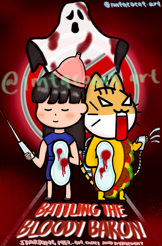
This request was redeemed by one of my moderators on Twitch, who goes by mel_on_cake, aka mel! She's one of the girls on my channel and my only female mod. I don't make a big deal out of this but we do bond over having do deal with girl stuff like periods, which I affectionately nicknamed the Bloody Baron to make the guys feel more comfortable and so we can curse at the Baron together.
Anyway, Mel had previously requested I draw something a movie poster similar to the Ghostbusters but change the ghost to the Bloody Baron instead and this was what I drew for her last time:
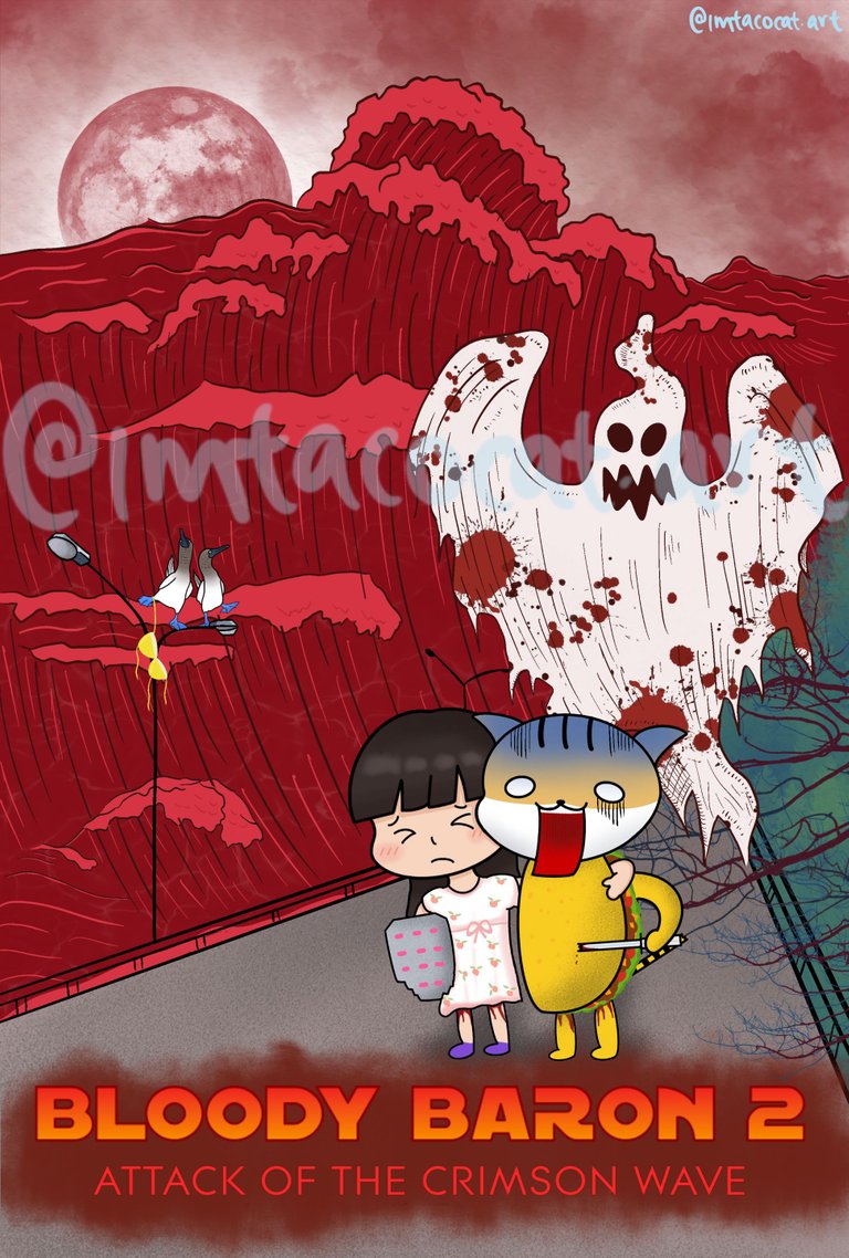
This time, she wanted a sequel and came up with her own title too - Bloody Baron 2: Attack of the Crimson Wave, which I thought was brilliant! She also had very specific instructions on what she wanted it to look like this time.
For starters, she wanted me to use the font from Star Wars, and to emulate the Crimson Wave from this poster from The Wave (which I didn't even know was a movie). She also wanted our poses to be similar to the poster, with my holding a tampon katana and Mel holding a shield made to look like menstrual pills.

Source: Best Buy
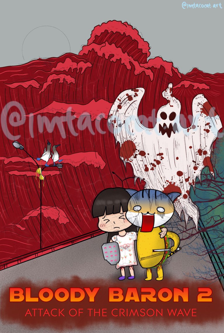
Mel also wanted me to add two birds on top; specifically the blue-footed booby, with one of the birds slightly smaller than the other and a bikini top hanging around one of the birds' legs. She said it's to signify actual boobs irl since they get sore and slightly uneven during that time of the month.
I was kinda overwhelmed with all the specifics but girl knows what she wants and I'm here for it, and it sure makes it easier on me somewhat since I don't have to think too much about the design. She's the brains and I'm the hands I guess.
These were the references I used:
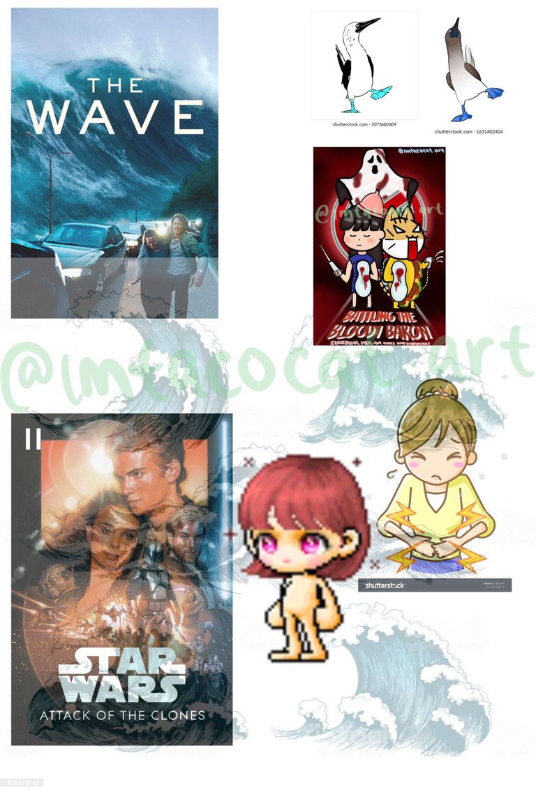
And after sourcing the fonts I did a rough draft tracing the poster and the ghost I drew from last time. For the wave I couldn't draw it exactly like the poster and tbh I didn't want to either, so I opted for a simpler version using Japanese Kanagawa-style waves as a reference. I liked the detail in the lines of the waves in that style and wanted to apply it here if I could.
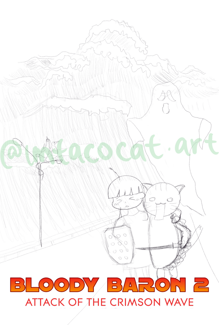
I thought it looked iffy as a sketch, but I didn't really know how else I could draw it so I just went with it. I definitely needed to adjust our character proportions a bit so they wouldn't be so awkwardly tall, and I also wanted to draw a different ghost to represent the Baron to make it creepier-looking.
So after some tweaks, we get this sketch. I also used a moon brush I had to add in the moon which I thought was appropriate.
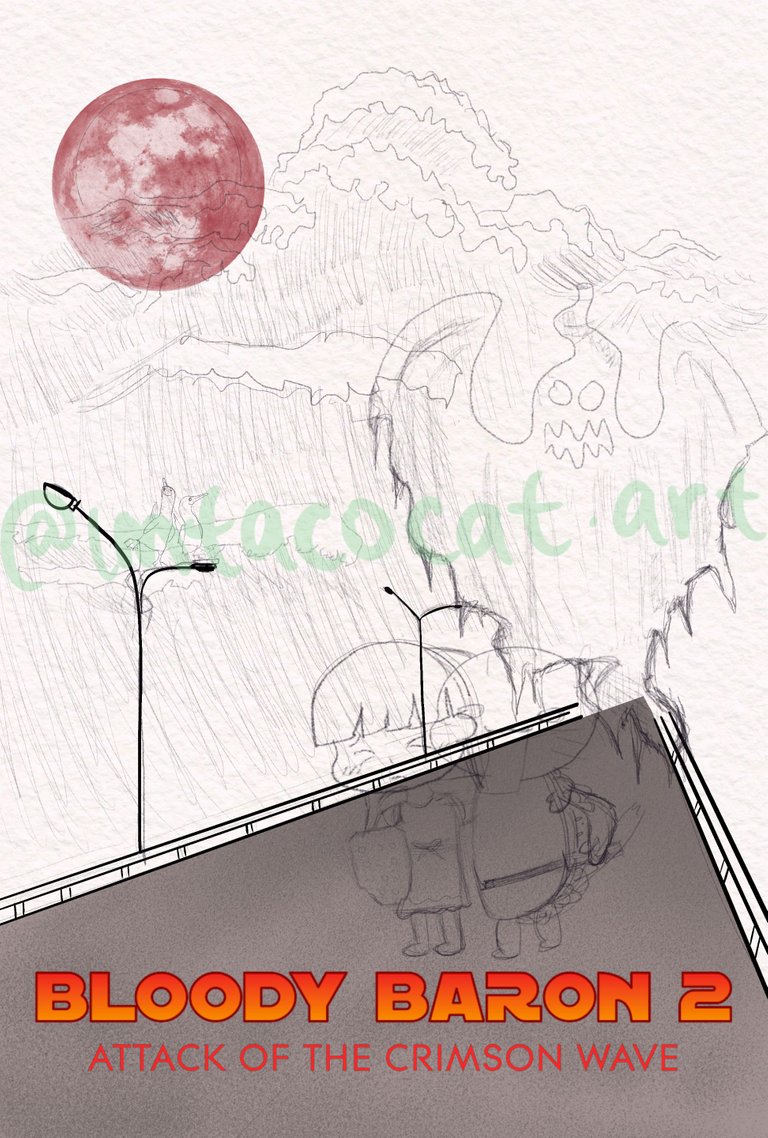
After that it was time to work on the wave itself, since this was the biggest challenge. This definitely took a while since I wasn't really sure how to approach it. I outlined the tops of the waves in black before adding the red colour and made the foamy parts lighter.
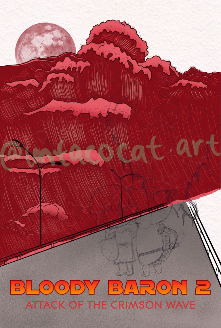
The lines still didn't look right to me although I went over them twice with different colours. I asked Mel and my chat how I could make it better, and they suggested I curve the lines a little more. So I tried it and I think it did look a lot better! After that I worked on outlines and colouring in the ghost as well, with some cross hatching to match the wave and we get this:
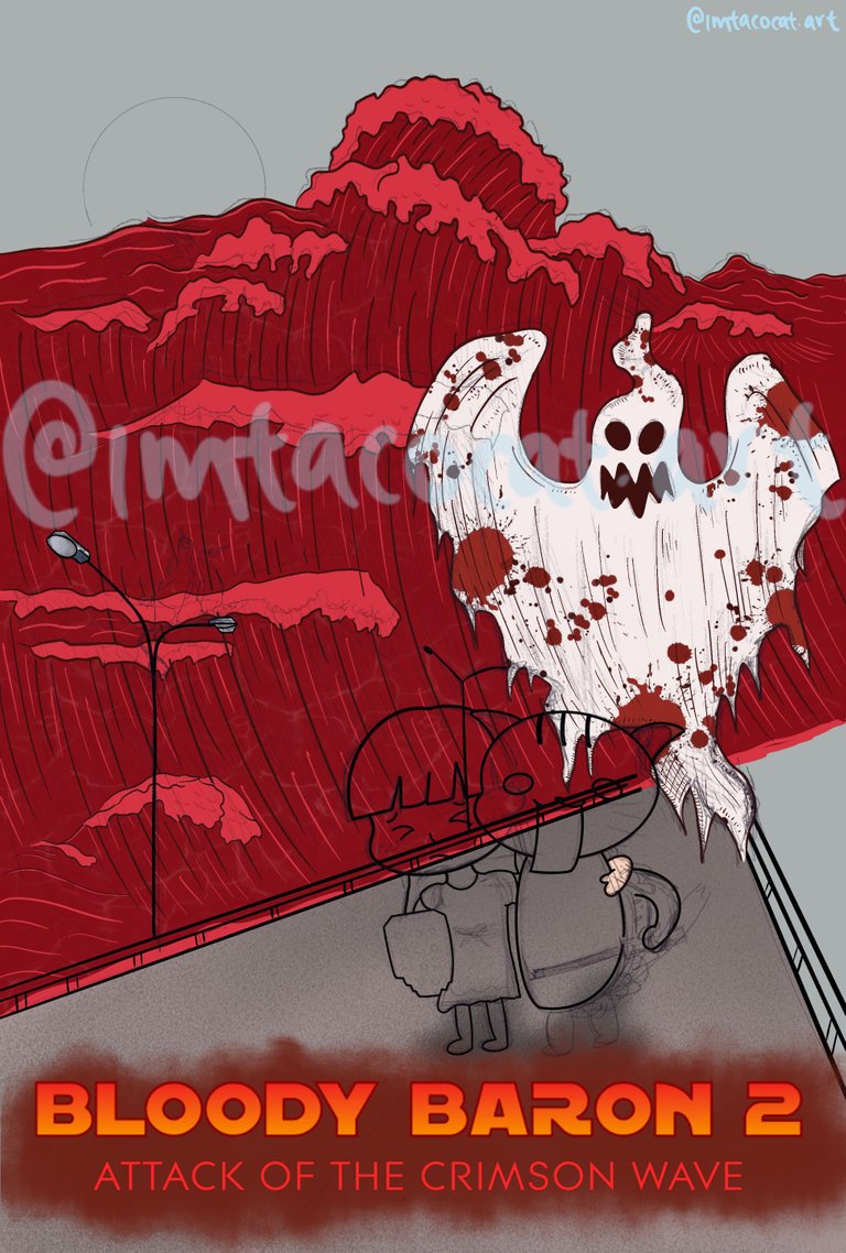
I thought it was looking pretty good already! Next was colouring our characters. The positioning was a little tough to get right due to the chibi bodies but it looked okay in the end.
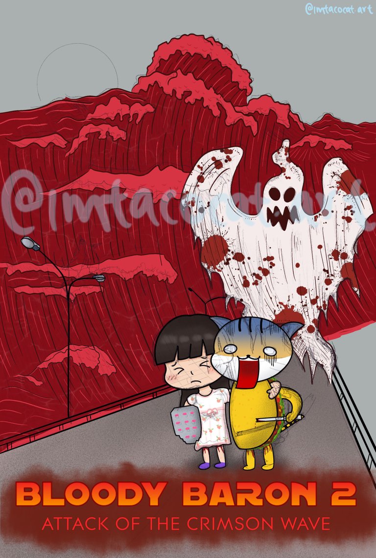
For the birds I just copied a vector I found online and with one of their feet up it was perfect to draw in the bikini top as well, which I made yellow to contrast the red wave. I didn't really know what to draw on the other side of the road, so I just made it look like there were trees on that side since I wanted to include some green for contrast too. I also had a dead tree brush that matched well with the Baron.
After I added some final touches to the sky, it was done!
This one sure took a while and was a challenge at times but I think it was worth it! I would've liked to draw our characters in the same style as the Baron but I wasn't really sure how that would work with my TacoCat, and the expressions seemed too comical for that style anyway.
I'm just glad Mel loved it and thought it was awesome! Here's the timelapse:
https://youtube.com/shorts/nzpTSXMHgTo
If you're interested, I do draw on stream sometimes and you can even claim free artwork if you get enough channel points! We also play lots of interactive games so come hang out with us on my Twitch channel!
Thanks so much for reading!
To find out more about me, check out my intro post here!